I love the idea of giving players visuals of the people they meet. Sure, we GMs paint pictures with our words, but a picture is worth 1000 of those. At least, most of the time. Overall, I give the Rite NPC Deck a passing grade, but I do have feedback for the designers, because I am interested in more of this type of product from them.
Form enhances function for me with this product. I have physical NPC cards from another company, and they are great. But I wish they offered a free digital version to customers, as well. I can use digital NPC pics on my iPad and laptop. I can always print out a physical version, and prefer having the digital version to start. So the Rite product serves my needs well.
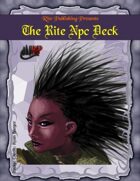
The product contains 49 NPC headshots. You can see a few previews. There is a nice variety of NPCs, and you are sure to find a few to suit your campaign. That is my first quibble. I would prefer to see themed decks in the future. There are three cat people and a couple of robot NPCs in the deck, and my campaign does not feature those races. I also realize the universal nature of art, but would prefer to see decks based on core rules of Pathfinder or D&D 3.5, for example, with other decks themed around more exotic races. I'd dig an all humanoid deck, for example.
I like the art style. I am not after photo-realistic portraits, nor do I want too much detail. I just need to give my players a good impression of the NPC, and to use the cards to inspire my NPC planning, as I prefer to select a portrait first, and use it to drive my NPC's design. The cards do this well with their style of the basics and not too much detail. For example, most NPCs have no wrinkles. You might consider this a deck of young NPCs, then, but I prefer to see it as a deck of ageless ones. So, I'll be letting my players know each portrait I use is a rough representation, and not exact, which works for me.
Most NPCs in the deck appear to be posing for their driver's license photo. There are pros and cons to that, and I'm not sure how things net out for me. A big pro with neutral expressions is you can design whatever NPC you want, or roleplay the NPC however you like, without betraying the portrait. If the NPC is happy today, angry tomorrow and sad on Moonday, the same pic provides a good baseline for each. The big negative is lack of inspiration. Featuring emotion on the pics might help with design or inspire players to roleplay more.
Ditto with the headshot style. Flipping just heads gives you the essentials on an NPC and freedom to design without betraying any details offered by a card. Flipping tails, however, gives you more detail to work with and get inspired by as you get a whole bodyshot to work with. Overall, I prefer the headshot style. Cheaper for Rite in the end, too, which should mean cheaper for customers.
A couple of the cards should not have passed approvals. Art is subjective, so I am open to this criticism being just my take on things. For example, one card shows the head of a wolf that comes off as sloppy and rushed, just blurred splotches in a wolf shape. But, I only felt this way about a couple of the cards, and it is rare I get 100% use out of an RPG product anyway. And I bet there will be GMs out there who love the wolf pic to bits. Such is art. (This argument also mitigates my complaint that the deck contains some races not present in my campaign.)
I have a quibble with the card design. Each card has three layers: the frame, the background and the portrait. Overall, I feel the frame and background patterns do not interfere with the NPC pictures. They are a bit too much for me, though, as I think they prevent some NPCs from "popping" off their card, which would be my ideal.
I do feel the photo credit on every card is intrusive. I'd prefer they be placed on the frame, which is darker. Sometimes the text partially covers the NPC pic. This is crazy, due to the nature of the product. In a rulebook I would prefer not to see big artist credit notices that sometimes cover the illustrations, but no big deal if it happens because the product's purpose is all about the rules. However, if the entire product is all about the art, then the art should be displayed unimpeded by labels or noisy backgrounds. So, I vote for the credits text to be shifted to the bottom right hand corner of each card, out of harm's way.
Bonus points next time if the layout accomodates a space for GMs to add their own text, either digitally or on printed versions. The frame bleeds to the edge, so there are no clear places to write on. Digital cards have no backsides, either, though you do have more colour and highlight options. For example, my main need is to put the NPC's name on their portriat. On the other hand, I do not want an empty label box on each card just for NPC names - that's distracting. Just provide a blank space on the bottom that does not compete with the art, nor create a distraction if I opt not to put anything there, but is there if I need it.
While I have provided some minor concerns, I love my Rite NPC Deck and will be using it next session of my Pathfinder game. I like the art style, the portrait style and variety of portraits. If they produce another deck, I'll check it out for sure. So thumbs up from me for GMs to consider this product for their games.
From: roleplayingtips.com
Rating: [3 of 5 Stars!] |